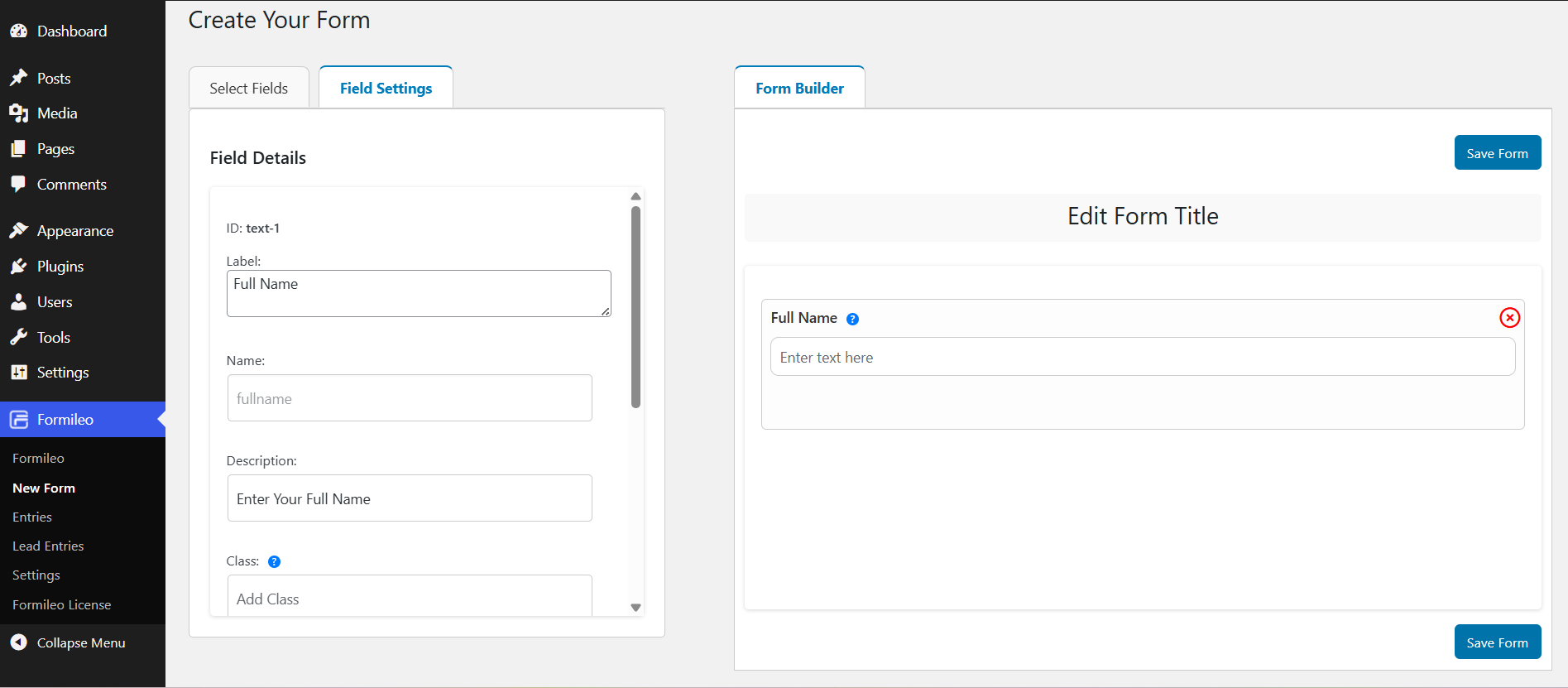
This short article gives you a quick overview of the Form Editor, which is the primary environment for creating a form with Formileo.
How to create a Form?
- Log into the WordPress Admin panel.
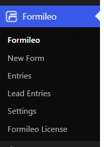
- Navigate to the “New Form” under “Formileo” in the left-hand menu. It will open the form builder where you can create your form.
- Start by giving your form a name—you can always update it later. This makes it easier to find and manage your form down the road.
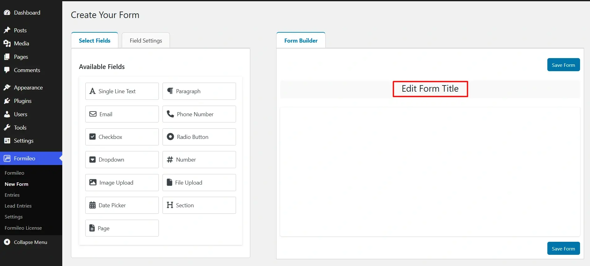
- Drag the fields from the “Available Fields” section into the “Form Builder” area to build your form.
- Customize each field by adjusting settings, such as making them required or adding placeholder text.
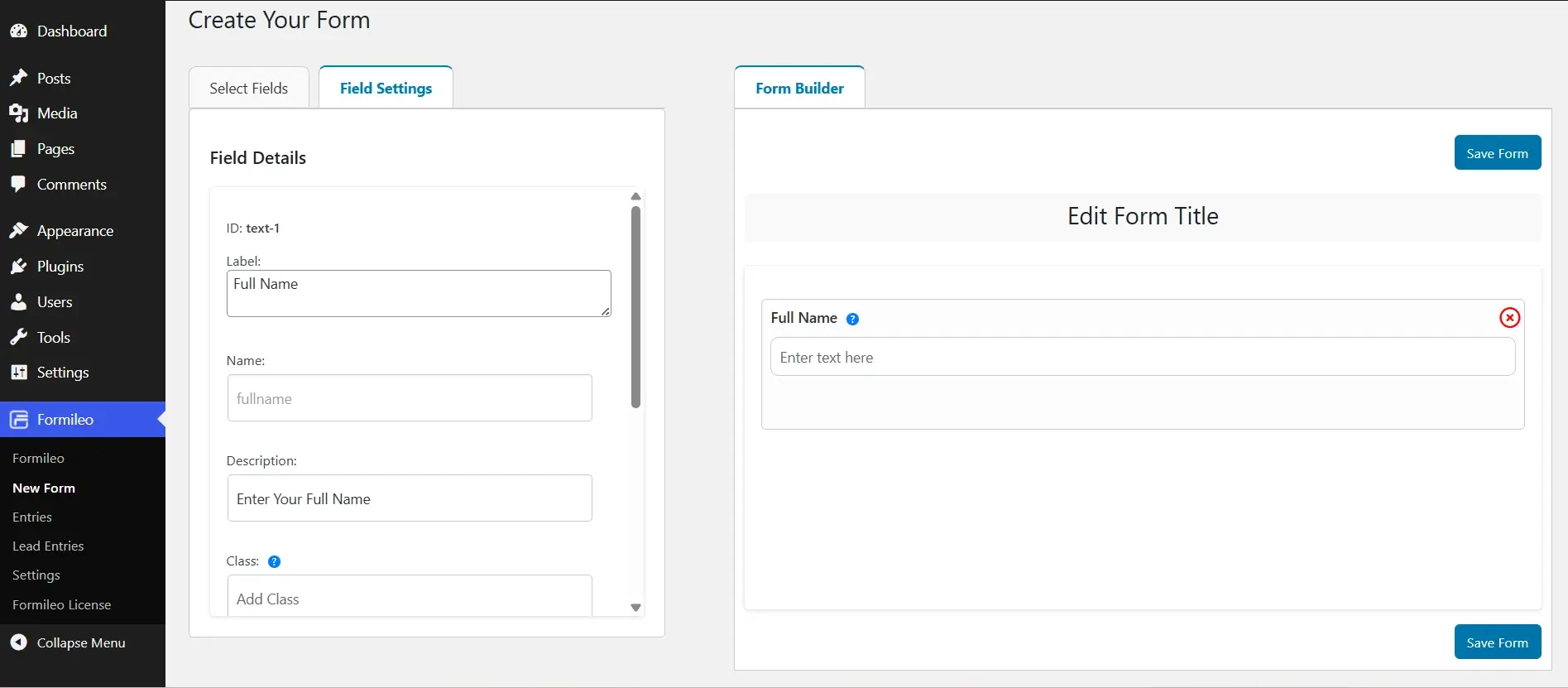
- Once finished, save the form.
Standard Form Fields
Fields Available for form
Below are the fields available for the Form Tool Builder.
- Single Line Text
- Paragraph
- Phone Number
- Checkbox
- Radio Button
- Dropdown
- Number
- Image Upload
- File Upload
- Date Picker
- Section
- Page
Single Line Text
The Single Line Text field allows users to submit a single line of text. This basic field can be used for anything where no more than a single line of input is required.
Single Text field as displayed in the Form Builder:

Paragraph
Provides a larger text area for users to enter longer text, such as messages or descriptions.
Paragraph field as displayed in the Form Builder:

Email
The Email field lets you collect email addresses from users.
Here’s how the Email field looks inside the Form Builder

Phone Number:
The Phone field allows users to enter a valid phone number.
Here’s how the Phone Number field appears in the Form Builder:

Checkbox
The Checkboxes field displays a list of options with checkboxes, allowing users to select more than one choice.
Here’s how the Checkboxes field appears in the Form Builder:

Radio Button
The Radio Button field allows users to select a single option from a predefined list.
Here’s how the Radio Button field appears in the Form Builder:

Dropdown
The Dropdown field provides a compact menu that allows users to select a single option from a predefined list.
Here’s how the Dropdown field appears in the Form Builder:

Number
The Number field allows users to enter numeric values only, such as quantities, amounts, or any data that requires digits.
Here’s how the Number field appears in the Form Builder:

Image Upload
The Image Upload field allows users to upload image files directly through the form. This is ideal for collecting profile photos, product images, screenshots, or any other visual content.
Here’s how the Image Upload field appears in the Form Builder:


File Upload:
The File Upload field allows users to upload documents, PDFs, text file, or other file types directly through the form.
Here’s how the File Upload field appears in the Form Builder:


Date Picker
The Date field allows users to select a date using an interactive calendar picker.
Here’s how the Date Picker field appears in the Form Builder:

Section
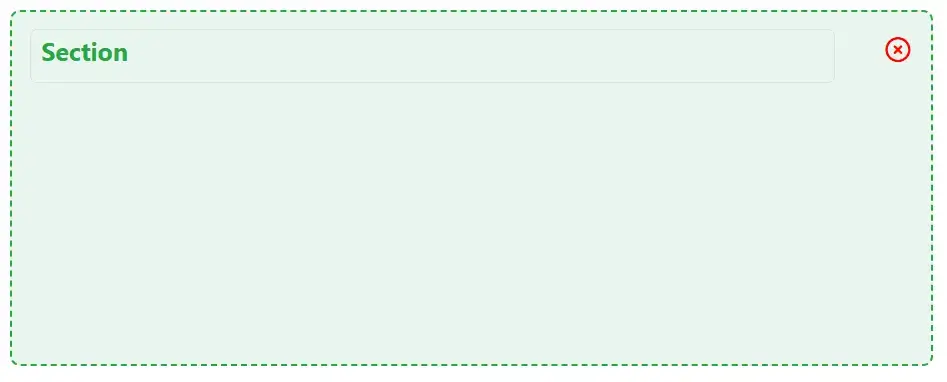
The Section field creates a container that groups multiple fields together, helping you organize your form into clear, structured parts.
Here’s how the Section field appears in the Form Builder:
Page
The Page field allows you to break your form into multiple pages, making it easier for users to provide detailed information step by step.
Here’s how the Page field appears in the Form Builder:

Fields Settings
Field settings apply only to the selected field, giving you control over its behavior, appearance, and functionality. Each field can be customized individually to suit the needs of your form.
Field Label:
The field label is the name by which the field is displayed. It appears on the front end of your site when users fill out the form. Labels help users understand the purpose of each field.

Description
A description provides additional context or instructions for the field. This text helps guide users on how to fill out the field properly. If enabled, the description as a tooltip alongside the field label.

Class
You can add a custom CSS class to apply specific styling rules to the field. This allows you to override default styles and tailor the appearance of the field to match your design.

Field Size
The field size (small, medium, or large) determines the width of the input area for most fields. By default, the field size is set to large.

Placeholder
A placeholder is an example text that appears inside the field, providing a hint about the type of input expected. The placeholder text is not saved with the form entry—if the user leaves the field blank, the corresponding entry will remain empty.

Field Logic (Conditional Logic)
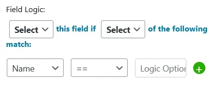
Conditional logic allows you to dynamically show or hide a field based on a user’s input in another field. This helps create smarter, more interactive forms that adapt to user responses.
Example:
Suppose you ask the question “Do you enjoy outdoor activities?” using a radio button field. If the user selects “Yes”, a related checkbox field appears with a list of outdoor activities to choose from.
The radio button field contains the question.
The checkbox field contains the activity options.
Conditional logic is applied to the checkbox field, so it only appears when the user selects “Yes”.
